Recipe Zine & Collateral
Visual Communication Design, 2021
Duration
8 weeks
Tools
Adobe Ilustrator, Photoshop, Lightroom

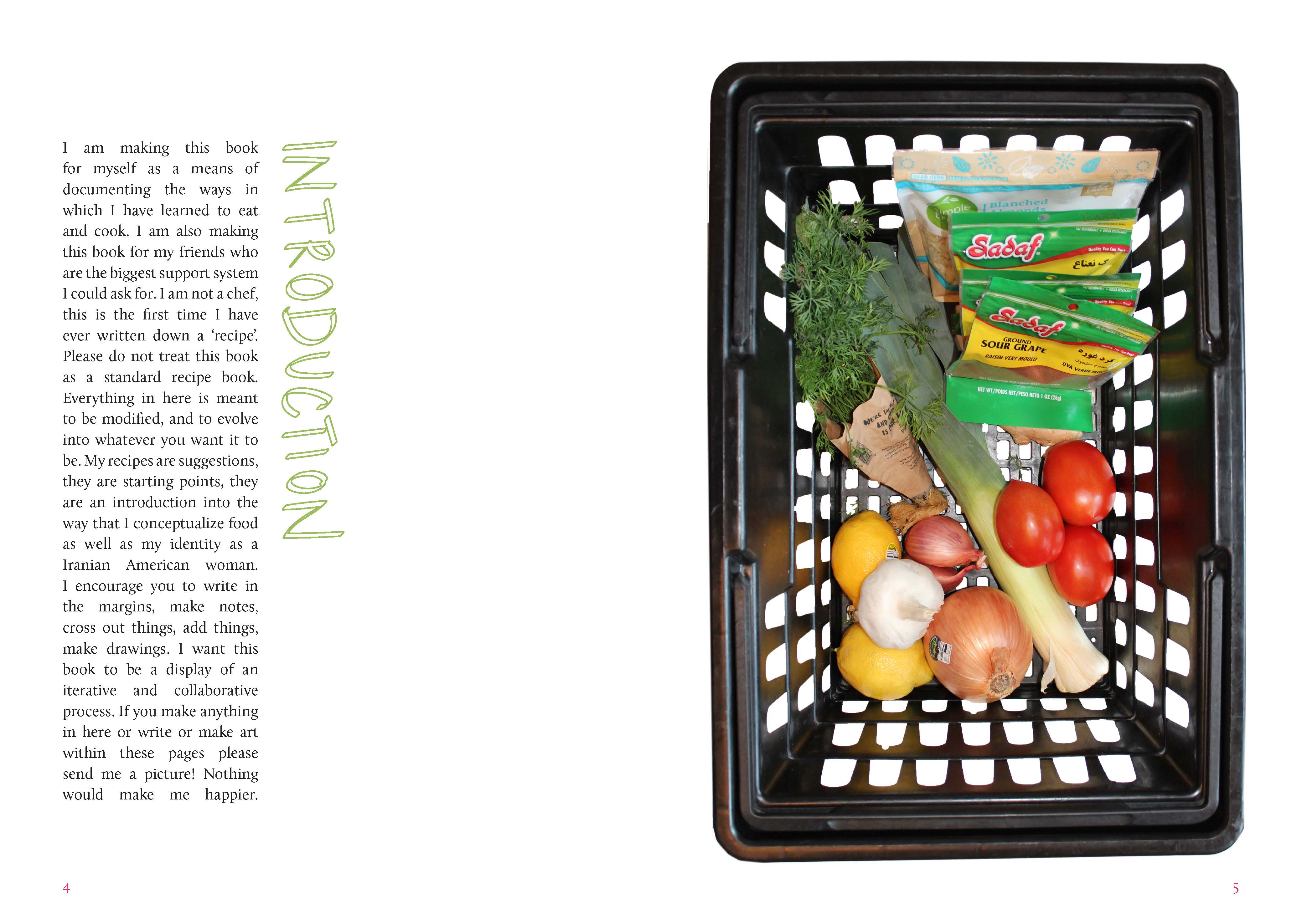
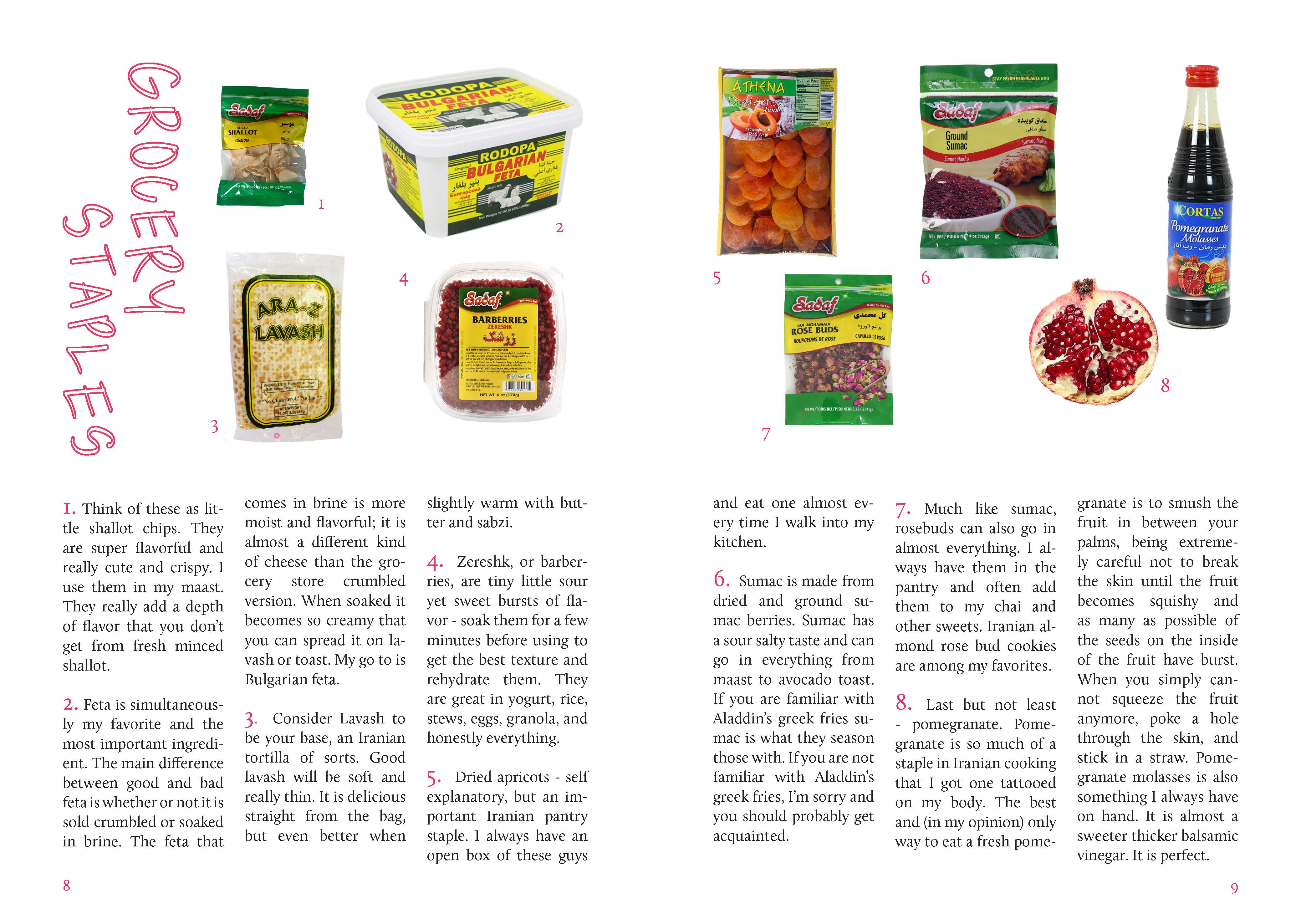


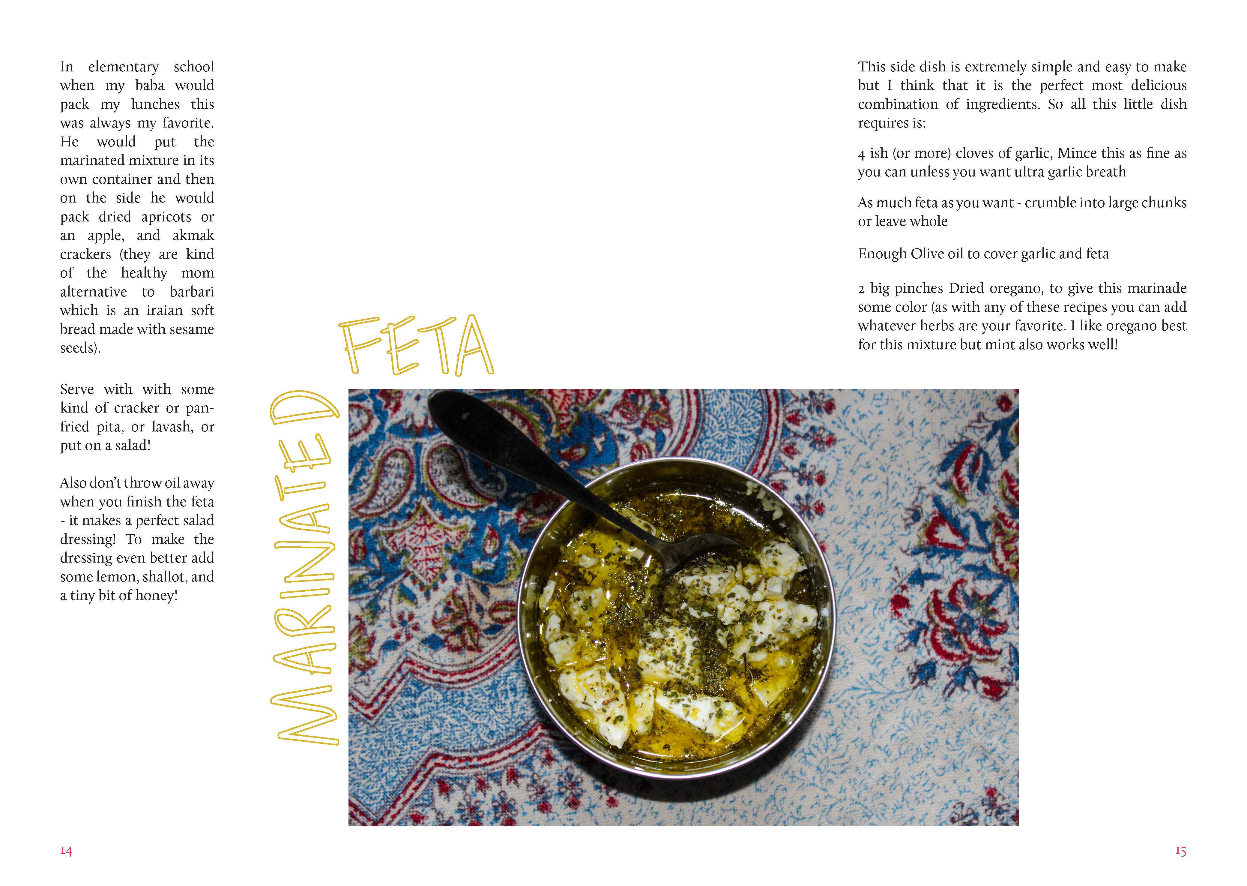


This zine focuses on my own food and food stories. The zine also includes my own approach to food along with recipes/instructions on how to make a few of my favorite dishes as well as the stories that accompany them. Food has always been a huge part of my life not just the act of cooking but also the act of sharing and enjoying the entire process of a meal.
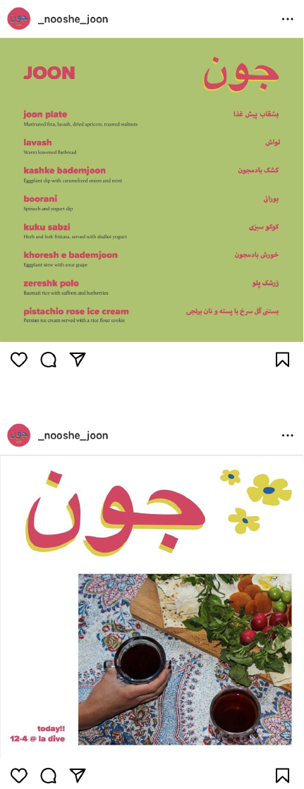
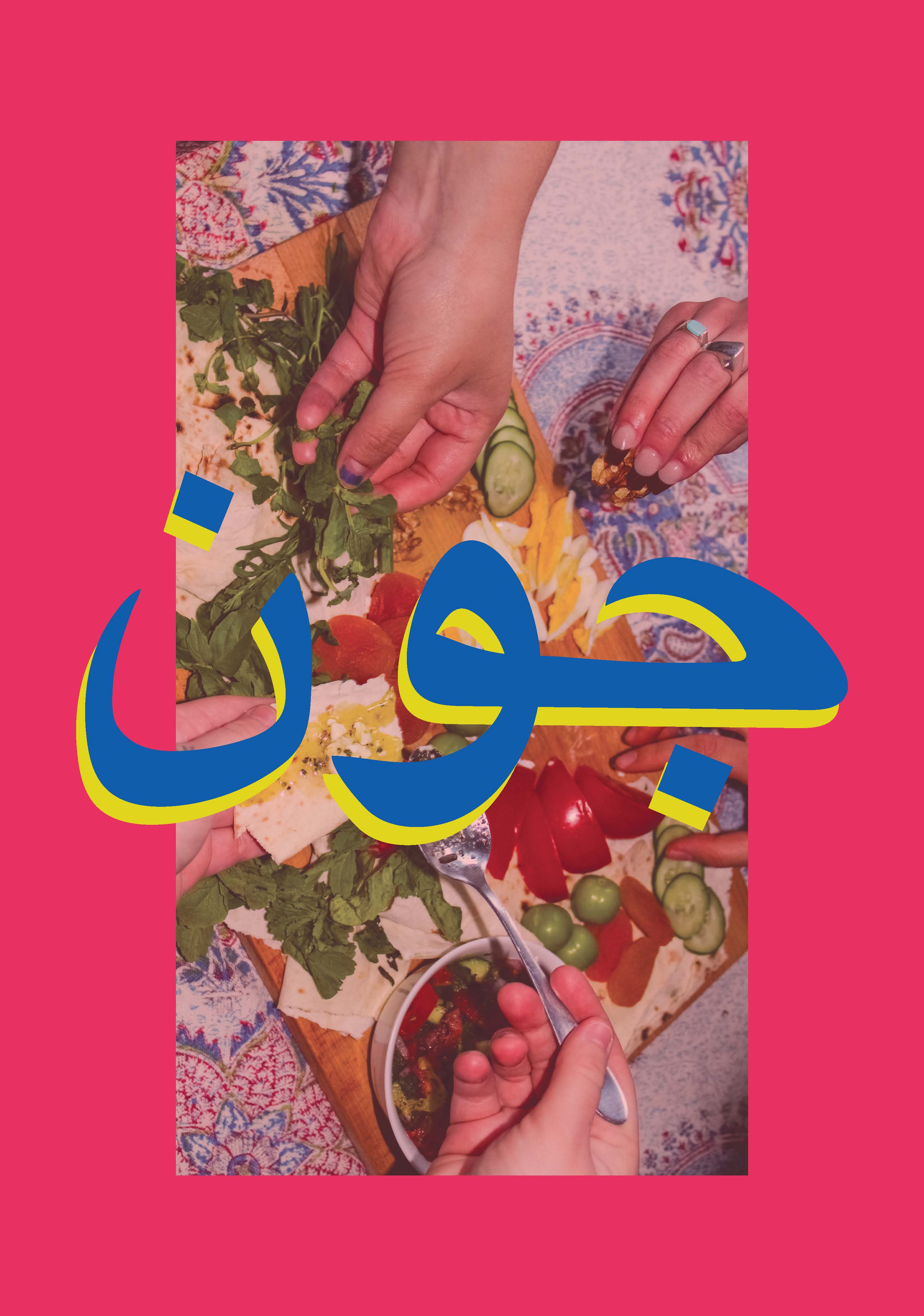
In Farsi ‘joon’ directly translates to life which also ties into the correlation between food and life. But also is more commonly added to someone’s name as a term of endearment to mean dear or sweet. I call my dad baba joon and he calls me Gracie joon.
This project has since grown into multiple of my own Iranian food pop-ups at a local wine bar in Seattle. For the pop-ups I created menus, sourced food ingredientsa, made the food using my own recipies and promoted the events on social media with corresponding marketing material.
🧿️🧿️🧿️
︎ Follow Nooshe Joon on Instragram
Moodboard
Typography
I wanted my publication to be legible and clean while also feeling intimate and unique. For this reason I chose to use a sans-serif typeface sparingly some headers as well as for graphic elesements. From the start of this process I knew that I wanted to include handwritten elements. However, I chose to use them sparingly to keep the publications clean and legible look. I chose to use Calluna, a serif typeface, for the body copy because I thought it paired well with the unique and modern look of both the hand lettering and the sans-serif typeface.
Colors

When deciding to add color to my publication I didn’t want the colors to interfere negatively with the food or distract from the colors of the food. I pulled my color swatches directly from the images that I took of the food. I used color primarily in my hand written titles and sparingly throughout the publiction as graphical elements.
Collateral Material